Music Magazine Double Page Spread-1
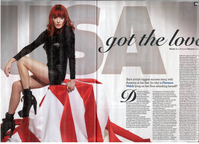
This double page spread mainly features the artist Florence Welsh, from "Florence and The Machines". The large image of Florence is very attractive to the audience as it stands out against the white background, it also takes up a whole page making the double age spread simple but effective. The use of 3/4 colours is very effective as the red in the subjects hair contrasts with the red on the USA flag, as she is wearing black the red really stands out and catches the eye of the audience. Florence is also looking directly at the audience creating direct address. the use of direct address makes the audience feel like they can relate to the subjects as its only good manner to look at someone when they talk to you.
The colour scheme is mostly made up of black, white and grey. This creates a subtle mood as there is not much use of bright/vibrant colours, also this helps with the genre of which the magazine is.
The text on this double page spread is typically set out in collums as this makes it easier for the audience to read the text. Two words in the caption are in a blue colour to symbolise importance, these two words are FLORENCE WELCH. This suggests that the subjects name is quite important or maybe even just to show that shes different to other artists.
This double page spread uses a sort of symetrical layout as it uses both black on white for the text and image. This gives it a appropriate and neat layout. The shape in which the colums are presented are almoast a square ouytlining of the position florence is sitting on the flag.
The 'Got the love' really stands out as it is in a big, black, handwriting font. This also stands out as it is the title of one of Florence's songs. the USA just behind the song title matches together to bing the message of USA's got the love this suggests that the magazine is american and would appeal to a more american audience.

No comments:
Post a Comment